 Yahoo has bought nearly 30 companies since Marissa Mayer took over as CEO. A large number of those were talent acquisitions — though not all of them. Among the product or technology acquisitions, Aviate could turn out to be one of the most strategic and important.
Emphasis on the word “could.”
Aviate presents itself as an “intelligent homescreen.” It’s an Android launcher that organizes and customizes the presentation of your apps. Though not fully mature, Aviate offers a number of different, intriguing opportunities for Yahoo.
Aviate can potentially help Yahoo come back in mobile and local search — although the company needs a multi-pronged approach. It’s also the Yahoo’s best potential answer to Google Now.

Aviate is in private beta right now so most Android users haven’t had an opportunity to try it. I installed it last year, didn’t immediately see the benefits and so uninstalled within about 48 hours.
Since the rumored $80 million Yahoo acquisition I’ve reinstalled it on my Nexus 7 tablet and have been using it daily. Now that I’ve been more patient with Aviate I’m starting to see its value. However there are a number of missing features and capabilities. It’s not yet “robust” enough to fulfill its strategic potential.
Needs a Search Box
Putting aside any technical capabilities on the back end, which I can’t directly speak to, the most obvious thing missing from Aviate is a search box. I’m not just saying this because Yahoo is pushing to get back into search. It would provide genuine utility to the app.
I’m sure that Marissa Mayer clearly understands how helpful to users and to Yahoo an Aviate search box would be. I initially found myself poking around for a way to search from the homescreen rather than using the Google app.
Any Yahoo search functionality should also incorporate the ability to find and launch Android apps on the device (and perhaps in Google Play). Even though a “bookshelf” of apps is just a swipe away (see image above), users will want the ability to find and launch apps via search — as you can on Android (via Google Search) and the iPhone.
Allow Homescreen Image Personalization
The hot-air balloon image you see above currently cannot be changed (it becomes darker or lighter depending on the time of day). That must change.
The ability to personalize that space is critical to the ultimate success of the app. Similar to the way Bing uses beautiful imagery on its site, Yahoo could also do something really elegant and clever with changing Flickr images in that spot. But users must also be able to upload their own images.
Someone may come back and say, “It can be changed.” Indeed my hunch is that it can be customized. Yet after several attempts I haven’t figured out a way to do so, which means the option isn’t intuitive enough. Speaking of which, the entire app needs to be at once simpler and offer more functionality.
Make the App More Intuitive
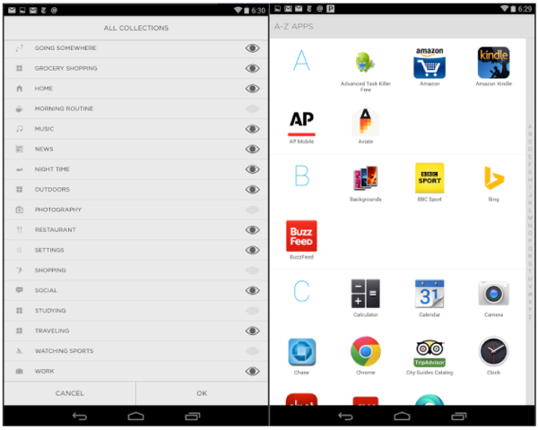
The impressive thing about Google Now is that it works without much active customization. Currently in the settings area of Aviate is a long list of “collections.” These categories help organize apps by type; they can be thought of as an alternative to folders on conventional Android or iOS.
There are both a default set collections and an alphabetical list of apps. Collections can be turned on or off. Aviate will offer you different collections based on time of day (such as “morning” or “work” in the am) or other variables.

There should be fewer collections. There should also be a customization option that allows users to create their own collections categories. In addition, the collections list isn’t obviously accessible. It takes a bit of time to find how to access it.
That’s a metaphor for the fact that the app overall is not quite as intuitive as it needs to be. (Some of this could be addressed with a new user tour on the app.)
Yahoo Now: More Personal Assistant Functionality
Yahoo also needs to use the homescreen real estate to push and show more dynamic content: upcoming meetings, weather, traffic, sports scores, top news, etc. Enabling this would make it much more of a direct challenger to Google now.
Some of this information is available if you pull down the homescreen image (calendar items, weather). But Yahoo needs to find an elegant way to push more contextually relevant content to users. There are probably several ways to use the homescreen real estate more effectively and make Aviate more powerful and useful in the process.
There’s a great deal more I could say and suggest, regarding local search and maps for example. I’ll leave those items for a later post.
My view is that Aviate holds enormous potential for Yahoo. However the company needs to push Aviate even further in the direction of an “intelligent assistant.” It needs to add more passive personalization and functionality, while simultaneously simplifying and making the app more intuitive overall. That’s no small task with lots of heavy lifting to be done on the back end.
The addition of a search box wouldn’t hurt either.
Postscript: I was finally able to customize my homescreen image. So that complaint/suggestion is addressed but there should be some more obvious messaging around it either in a tour or in a menu.
Contributing authors are invited to create content for Search Engine Land and are chosen for their expertise and contribution to the search community. Our contributors work under the oversight of the editorial staff and contributions are checked for quality and relevance to our readers. The opinions they express are their own.


