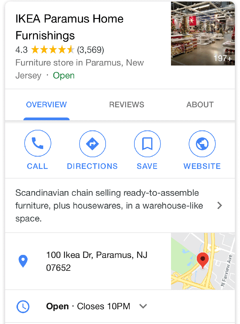
Google is now rolling out a new look for the local panel in the mobile search results. The new look goes from the blue interface with text buttons to a white interface with rounded buttons. Here is the new look you might be able to see now when you search for a local business on your smart phone:

Here is what this looked like the other day, in the blue interface:

Google has been testing this new interface on and off since January of this year.
If you do not see the new interface now, it might require a bit more time for it to fully roll out.
We have emailed Google for a comment and will update this story when we receive one.


