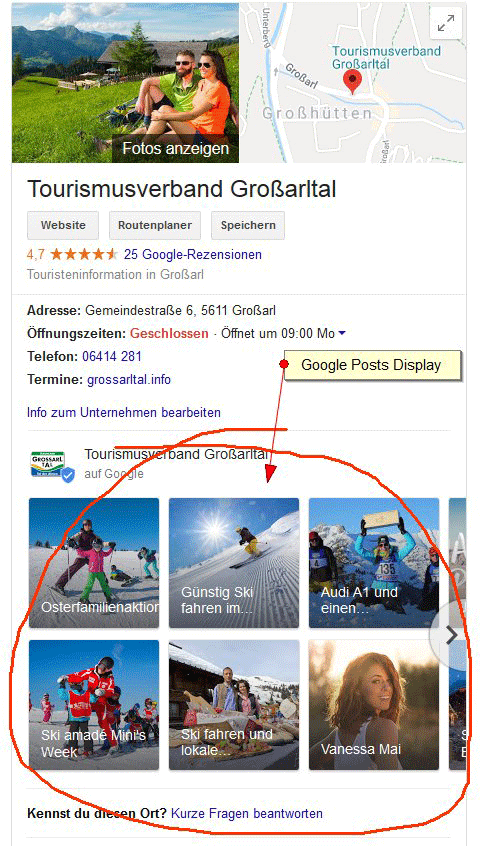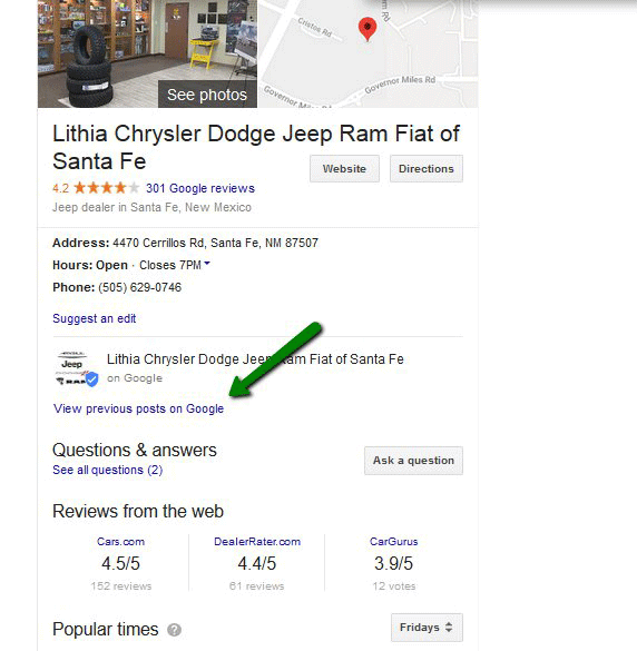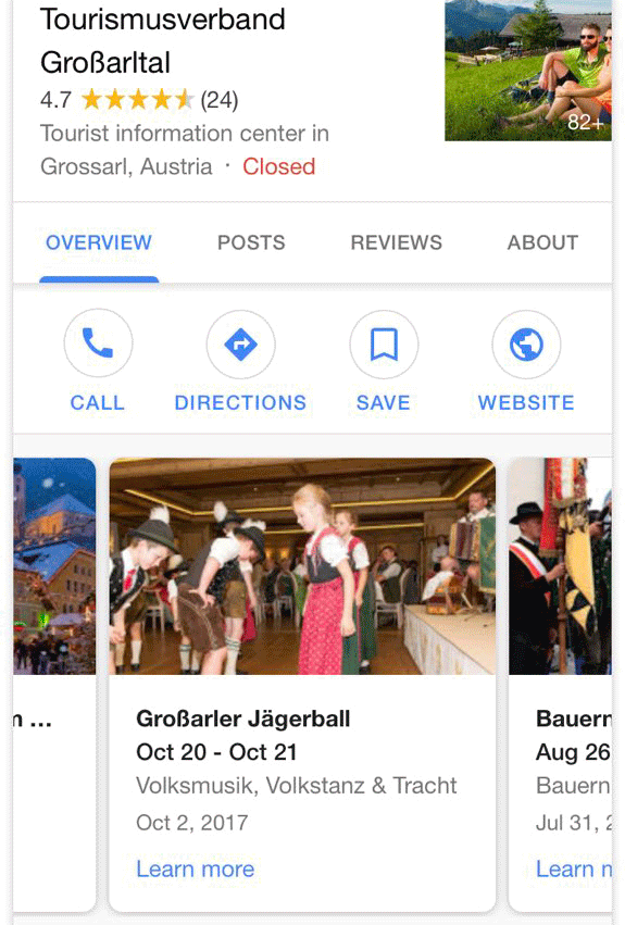
Google is testing new variations of how it shows Google Posts from local businesses in the search results. In the past week, we’ve seen three different variations of layouts and functionality around how these Google Posts are displayed when a Google local knowledge panel is returned in the Google search results.
1. Google Posts with an image box grid carousel format, spotted first by Petra Kraft on Twitter:

2. Google Posts with a minimalistic view, asking the searcher to view previous posts on Google, spotted by Ellen Edmands on Twitter:

3. Google posts with a carousel look, not too different from the normal mobile view look, but with more detail on the white knowledge panel interface. This was spotted by Mike Blumenthal and posted on his blog:


