Face it: You’re not a literary author, and people aren’t hanging on to every word you write. Don’t get me wrong, it’s great to have comprehensive information on a web page, but users also don’t want to scroll forever — especially on mobile.
Content on mobile needs to make it easier for users to get to the main points without cutting out the content, as users might want to dig into the details more at times. More than ever, the structure of your content is important, and your content needs to be navigable, skimmable and digestible.
Table of contents
A table of contents is a great way to show how you have organized your content, and combined with HTML bookmarks, it allows users to quickly jump to sections of a page that may interest them. For instance, my table of contents for this article would be:
Table of contents
HTML headings
Expandable content
Tabs
Filters
Summary, highlights, TL;DR
Bullet points or lists
Bold or italic text
Highlight important points
What about desktop?
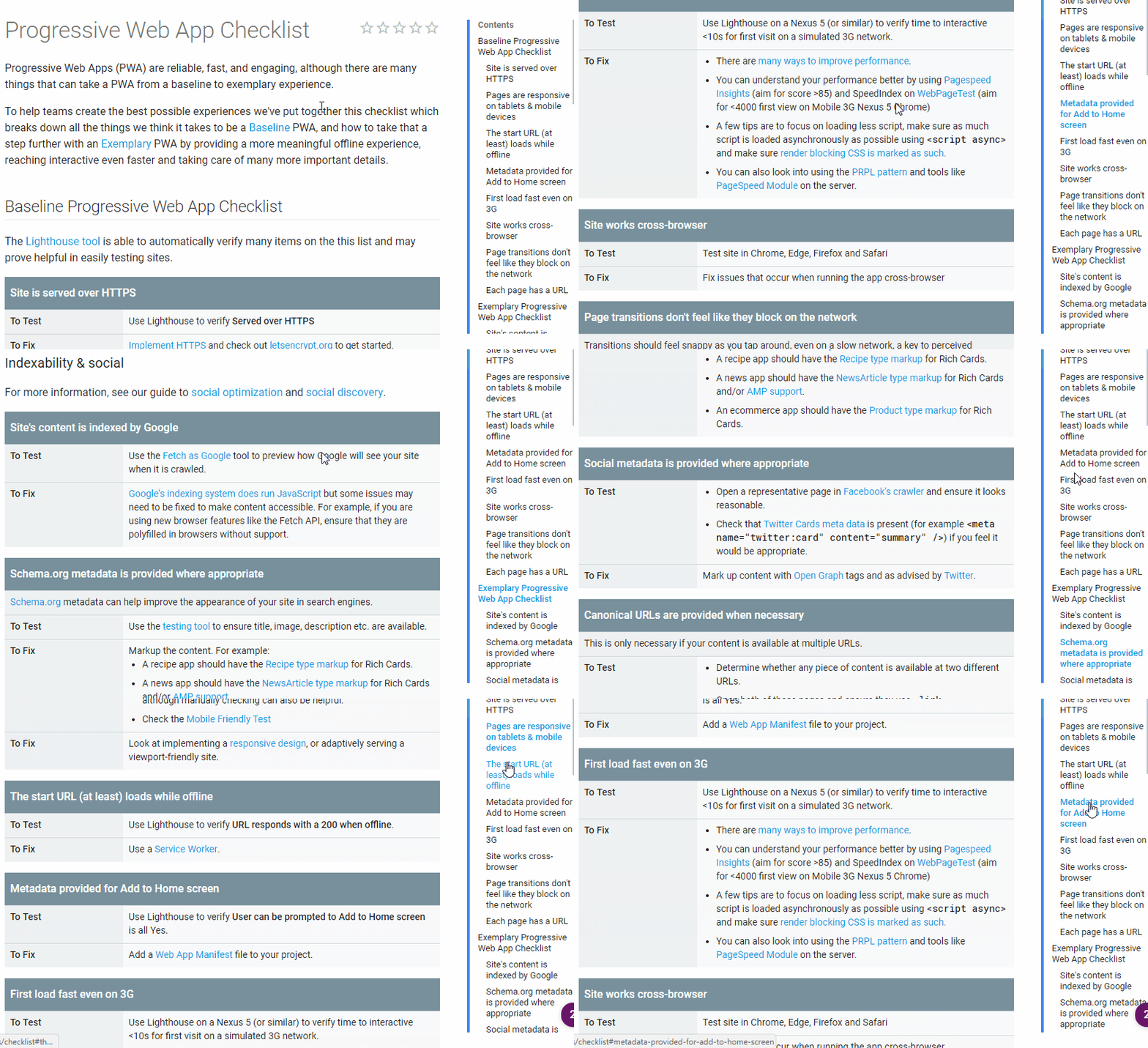
One of my favorite implementations of this is the Google Developer documentation, where you have the navigation right below the title and can quickly get to whatever section you need. They even made it expandable so it doesn’t overwhelm a user immediately.

HTML headings
HTML headings, or heading tags, help organize your content into sections, structuring your page in a logical manner with h1 – h6. The topical subheadings of this article are wrapped in h2 tags, while the article title itself is wrapped in an h1 tag. The heading tags make the content easily skimmable and are good targets for anchor links in a table of contents.
Expandable content
Expandable content areas (also known as “accordions”) are typically used for more details or FAQ sections. They are a great way to keep a page shorter and easier to navigate, while still enabling access to important information. Google Webmaster Trends Analyst Gary Illyes has stated that content hidden for UX reasons will be given full weight in the mobile-first index, whereas the desktop index slightly discounts this hidden content.
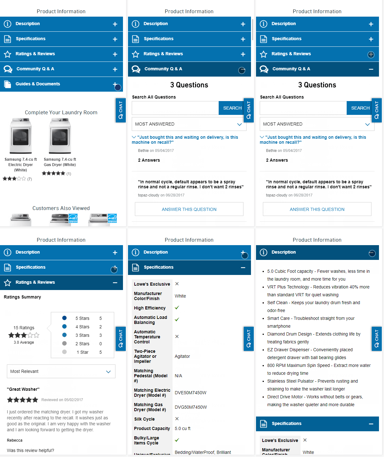
See how Lowe’s does this with the product description, specs, reviews, Q&A and documentation all there on one page — yet it’s not overwhelming, even to a mobile user. If they had all of this content expanded by default, I would be tired of scrolling before I got to the bottom of the page.
Tabs
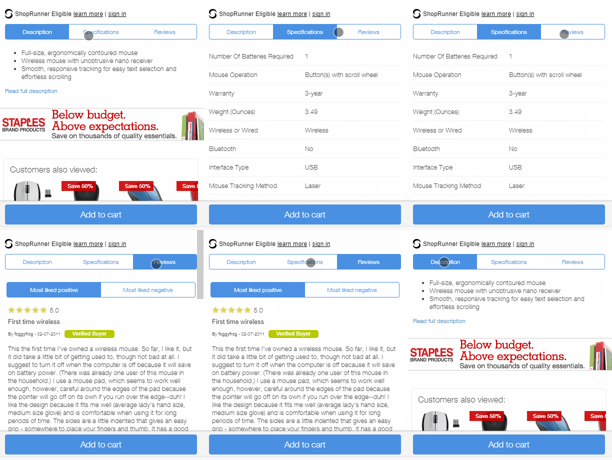
Tabbed content is used less on mobile because of space limitations, but this is an alternative to expandable content. It serves the same purpose, which is to hide content that may not be needed right away. See how Staples lets you see the description, specs, and reviews while keeping the content all on one page.
Filters
Filters are an easy way to cut out large parts of the content that a user may not be interested in. By giving them the option to see only what they want to see, you are making it easier to find the information they are looking for without going through all the cruft to get there. One of my favorite implementations of this visually is Northcutt’s Google Ranking Factors.

Summary, highlights, TL;DR
Don’t have time to read a story? How about just taking in the main points of the article quickly? This helps on-the-go mobile readers quickly digest your content and determine if they want to read more in depth. I commonly see this being done on news, financial and sports websites, where the most important information can be summarized in a few points. Here’s one from CNBC:

Bullet points or lists
Bullet points and lists are a great way to convey a large amount of information quickly.
- Point 1
- Point 2
- Point 3
- List item 1
- List item 2
- List item 3
Bold or italic text
Bold text catches the eye — and so does text in italics. Bold text can also be a great addition to a list to make the main items or points stand out even more.
Highlight important points
Pull quotes, block quotes or tweetable moments are easy for readers to recognize and tell them that you find this information important enough to make it stand out. Statistics work really well in these formats.
[pullquote]90 percent of the people who made it this far will likely read this pullquote.[/pullquote]
What about desktop?
I focused on designing for mobile, but many of the same practices are good for desktop as well. One of the best examples is, again, Google Developers, where the table of contents actually becomes a sticky sidebar that follows along with you and allows you to quickly navigate between the sections.
I will add one caveat, especially for the content that may be hidden by default with CSS or JS. Make sure all content is loaded into the DOM. If you have to take an action before content is loaded into the DOM, then Google won’t see it. Loaded by default and then hidden is okay, though.
Now is the time to think about your mobile readers and how they will consume your content. Make it as easy as you can for them to find the information they are looking for, and they will thank you by continuing to come to your website and doing business with you.
Contributing authors are invited to create content for Search Engine Land and are chosen for their expertise and contribution to the search community. Our contributors work under the oversight of the editorial staff and contributions are checked for quality and relevance to our readers. The opinions they express are their own.


