Google is rolling out a new design for the hotel search results after you search for hotel listings and click into the hotel interface from web search.
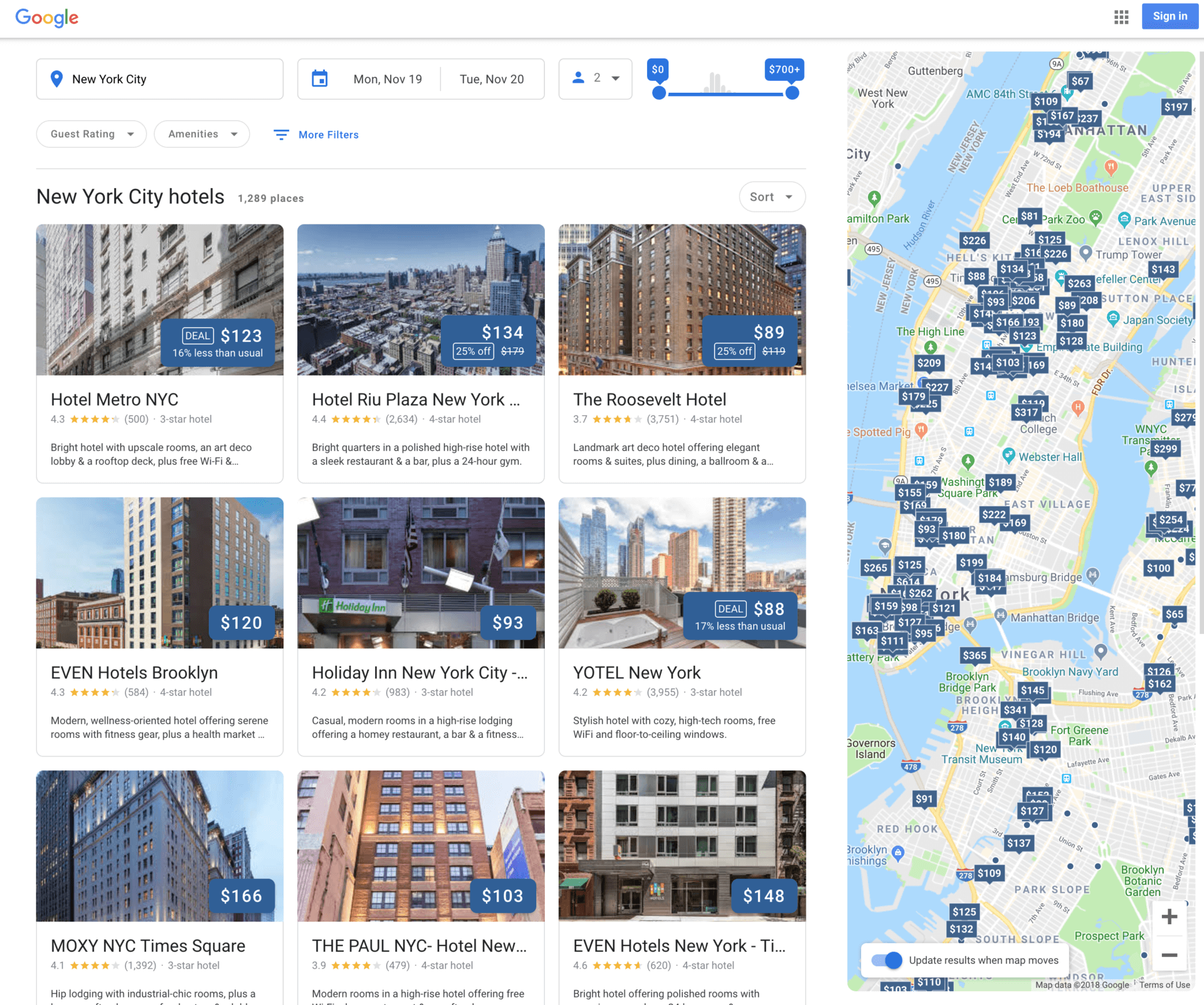
The new design uses a grid and card interface that shows hotel cards sorted by your search filter. You can further filter down the search results on the map by zooming in and/or dragging the map around. You can also change your date range, price ranges, review ranges and more, as well as specify which amenities are required and more.
New look: Here is a screen shot of the search results landing page for the new design:
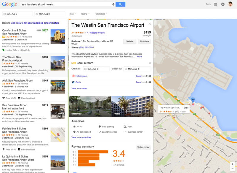
Previous design: This is what this page looked like back in 2015:
Deeper pages: Here is what happens when you click into a specific hotel listing:
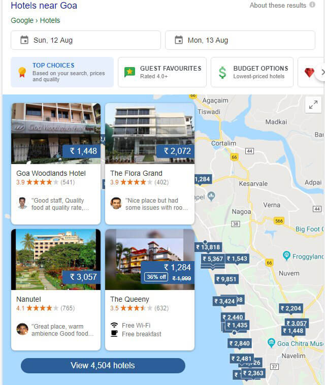
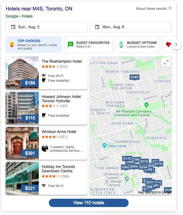
Previous design tests: Google has been testing this for the past several months as Sergey Alakov said and here are a couple of those tests we’ve seen earlier:


Why it matters? If you are a hotel provider, the design change to hotel search results in Google could impact your bookings. Keep an eye on the change, how your bookings and traffic change with it and make any necessary tweaks to improve your traffic from Google search.
Postscript: On October 31st, Google officially announced this on their blog citing these as new features:
- Photos from the hotel or fellow travelers
- Hotel information, such as neighborhood and location
- Hotel reviews from around the web that can be searched by keywords like “air conditioning”


